Case Study: Beachfox
Beachfox sunscreen was founded in Manly, NSW, in 2018. Their USP is a range of four differently scented SPF50 sunscreens (coconut, lime, vanilla and watermelon).
“Our goal is to change the mindset of how people view sunscreen. If we can encourage people to incorporate it into their daily routines, then it should become second nature, like brushing your teeth”
The approach
My role: Sole UX/UI researcher/designer
Duration: Six week research and design project
Context: Conducted during Academy Xi UX/UI design course
I used the double diamond approach (deep research to establish the main problems to solve for sunscreen users, then iterative design to evolve the solution)
1. Discover
This phase we go big on understanding the problem space.
Activities:
Stakeholder interviews x 2
Competitor analysis
Survey x 100 Australians
User interviews x 10
Survey findings
I posted a Pollfish survey that accumulated 100 responders in Australia. There were four multiple choice and two open-text questions and the gender split was 42/58 Male/Female.
Protection level, cost and trust were the three main factors in deciding upon a sunscreen
Most purchases are made in the supermarket, although 18% buy 'anywhere' as it's unplanned and 6% buy online
The most common cluster's of answers to the question 'what's the worst thing about buying sunscreen?' were:
Physical characteristics (e.g. sticky consistency)
Paradox of choice (either in store or online, there’s too much choice)
Cost (often too expensive)
User interviews
I transposed key quotes from the ten user interviews into an affinity map and clustered the key common areas. This naturally mapped into a sequential ‘journey’ when ordered chronologically.
2. Define
With a lot of information on the problem space from the previous phase, synthesis of the data helped shape the overall landscape of problems face by sunscreen users.
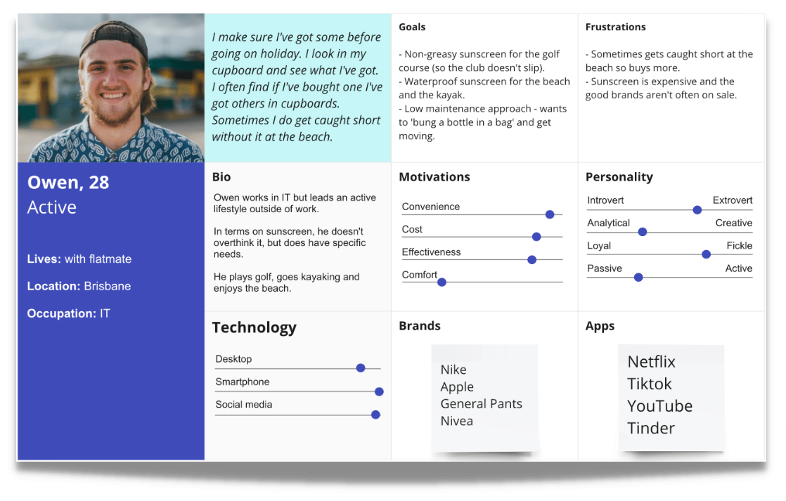
Using this data I was able to form three detailed personas reflective of the key audience.
Personas
Family orientated user who has systems in place at home to help family members stay on top of sunscreen use.
Active user with specific activity-based needs, but ultimately wants to 'bung it in a bag'.
Planner with a proactive interest in sunscreen who considers it part of a skincare routine.
Customer journey map
With three personas, I combined two into a single journey map - imagining and active persona (Owen) and a planner persona (Lizi) in a single household - and from the empathy and affinity mapping in the previous phase created a journey encompassing both users’ main pain points.
3. Develop
With a deep understanding of sunscreen users, their journey and their day-to-day pain points and desires I narrowed the focus to a single ‘How might we’ statement and conducted an ideation session with four Lizi’s and Owens.
The ideas were put into an MVP matrix to assess feasibility vs desirability, narrowing the field to five. These were then voted on in a survey, leading to the main idea.
Ideation & MVP definition
How might we help sunscreen users overcome the anxiety of cost and the paradox of choice so they can protect themselves from the sun over summer
4. Deliver
The chosen idea from the previous ideation phases was:
“A digital loyalty scheme where I can get freebies by checking off how many bottles I’m getting through”
I began creating paper prototypes, which evolved into a low fidelity prototype that was testable using Figma.
Low fidelity
5/5 found 'Loyalty' in the hamburger but looked on the homepage first
2/5 instantly got the 'coffee card' model. 3/5 understood once there was a token in place.
3/5 Wanted more information on the prizes earlier.
5/5 Found the notion of 'reset' confusing
Mid fidelity
Explainer text wasn't read, imagery was desired to tell the story.
Mechanism was understood.
If a user is signed up, they don't expect to need to add their email again.
Relative sizing of the copy on the 'win' page needs to make winning more obvious.
High fidelity
Findings in the final round of research fed into the high fedelity, colour version of the design. Learnings and evolved features included;
Simplified icons and imagery to explain rewards concept
More impactful visuals to show 'win'.
Rework of 'token' visual to make more obvious.
More information on potential prizes.
The 'rewards card' graphic needs to be top of the page in the whole rewards section as this does the bulk of the heavy lifting in explaining the concept.
The 'win' page is an improvement, but icons and graphic explainers may be needed to improve understandability of the page.
Tokens should be made more of through the experience (possibly using the Beachfox logo).


